24.5.14

OVERALL.

This project has been one hectic sleepless whirlwind which will definitely be a project to remember. The theme I chose was something that I have enjoyed progressing with from the beginning, looking at all the different ways that I can branch off from the Valley of the Dolls because the topic of fame and misery is so wonderful to work with.

Things that have influenced me immensely in this project would have to be looking at Damien Hirsts work in general thanks to my tutor who gave me the useful advise of looking up Hirst which I feel has definitely moved my research and project successfully forward and for the better which has lead to most of the decisions which all relate to my final outcome; things like creating the burn samples out of the plastic bags pushed me towards burning the chiffon for my final piece. I took some of his books out from the library and found his work so diverse and worked amazingly well with the different themes in my project from the flesh to the diamonds, trash to pills which have all inspired my work in different forms. 


Everything I done from sampling to organizing my sketchbook I have done by reflecting on my blog and sketchbook, even sketchbooks from past projects which always inspire me with new ideas and things to progress my project on with. This project has had me working back and forth attempting to create new and unique outcomes which I feel I completed  well enough for this project even though I did struggle with ideas at different points of the process but in the end created many different paths towards my final outcome.

Throughout the project I definitely did panic about the way my project was going and whether it was consistent enough throughout, and if I was going to finish on time; but somehow I managed to pull myself together and work even harder and work in a way that suited me better. I done this by completing two sketchbooks to enable confusion on my behalf; one for research and the other for fashion illustrations which I feel has strengthened my body of research all in all as the pressure to keep both books to a high standard was on. Also creating my garment seemed to challenge me greatly, seeing how I managed under pressure with no sleep and heaps to do was just an experience I will learn from as I initially gave myself two weeks to make, but with my time management being slightly off; I was only left with a week to make which put me behind but I managed to soldier through with the help of many cups of coffee. 

This whole project really was an eye opener for me as I have endured so much from creative blocks to having to resew a simple top five times, but it just shows that patience is key sometimes and things will eventually flow to you. I am impressed by my own ability to learn how to use a new software I had never even touched before to create a fashion film in just over a day to creating simple mouldy fruit. Overall I am pleased with my project as a whole as I feel the theme is strong as well as the final outcome with it; I will always see the project as unfinished but nevertheless completed to the highest of my ability and hopefully makes sense to others as it does to me.

23.5.14

Shoot Me

My favourite part of any project always always has to be the actual photoshoot and editing process afterwards, I just get this weird joy of knowing that its the final step and I get to edit it the way I want and finish it the way I want. The photoshoot in its self was amazing as I got to hire out an old chapel which had so much character to it and had a small platform also which worked amazingly for my theme, it just felt so easy to be inspired by poses to do and backgrounds to take advantage of, I absolutely loved shooting. My model was amazing also and I think it definitely helped that she does acting as she was perfect at acting all possessed for the fashion film and the shoot too. The only shame about the shoot is that my garment didn't show up as much as I hoped which is real shame and I'm not sure of what I could've done to prevent it but all in all I'm certainly excited about the whole outcome.


17.5.14

Cut, Sew, Stress, Cut Again

Making my garment this week was something I really struggled with especially since the stress started early on when I went to buy my fabric, to not pre burning my fabric which held me back. All sorts of things went wrong through my week of making but I still managed to finish in time for the photoshoot which was what mattered for me, even if I only had about 12 hours of sleep in total. 

As I had decided on previously, I wanted to use the pinky nude chiffon however when I got to Rolls and Rems, there wasn't enough of the colour I needed which then meant I had to go for the neutral nude, which was annoying since I really liked the pinky tone. 

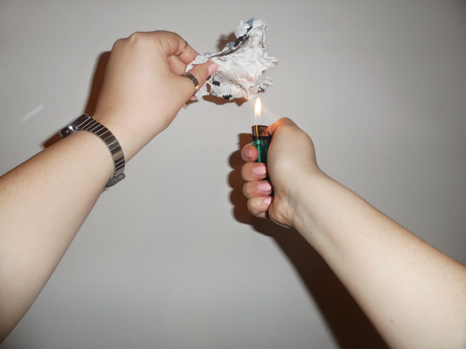
Once I got home I begun making right away, having to cut out each pattern twice to have enough strength to hold the piece up especially with the burning and embellishments. But already I had made a mistake in cutting out the skirt pattern before burning the fabric because it shrinks once it gets bubbled up therefore I had to hit the fabric shop again for more chiffon and this time start by burning up the fabric before cutting. Because the skirt was long and needed three patterns to make the skirt, I had to burn up three large strips of fabric which took me all through Eurovision to finish where I ended up with a bruised thumb by the end of it because I was using the lighter all night in order to do so. When I finished creating the burnt and bubbled fabric, I sized it up with the paper skirt pattern and in some places had to add more fabric but that wasn't a problem. 

After finishing off the top layers of the skirt I had to move on to the other layer underneath. It was a last minute decision on adding makeshift petals but I thought it would be a nice way to include the floral influence from before and I also thought it would be a nice graduation of colour as the nude was looking slightly bland, and the blue petals on the underskirt seemed to work really well. Looking back at it now I wish I had added more petals because it doesn't seem to show through when on camera but I still think it's successful appearance wise in reality. After both layers being done I managed to get it all sewn up 5/6 time, again making mistakes because of the sleepless nights but I managed to sew it up facing the right way in the end and managing to add the zip also. So after two days I had created a skirt (with no sleep in-between) which I was quite impressed with and loved how it flowed to the ground. 

The top shouldn't have been so hard to make, but again without the much needed sleep I managed to mess up quite a lot until realising how easy it was all along. After working that out I had an assembled and sewn top, and all it needed now was jazz it up with a lot of gems, keeping in mind the shoot was the next day. Luckily adding the gems to the top didn't acquire that much brain power and I was able to sit through and bejazzle the top as much as possible before the shoot. My aim was to get the whole top covered in the gems but just in case I didn't make it i scattered the gems down in sections in different places that wouldn't look odd if I hadn't finished in time, which happened to be the case in the end.

The skirt was made to the highest possible standard and I am more than happy about the quality of it as it was everything I hoped it to be and I'm happy that I started off with it as it's my favourite piece and represents my theme perfectly. The top however I'm not too pleased about since it was unfinished for the shoot but I hope that I can finish it on time for assessment. Overall the making process was tough on my sleep deprived head but I think I got through it well considering and think it still looks like a great two piece set as they both compliment each other piece well, and if I manage to finish the top it will be perfect I hope.


Own photography

11.5.14

Final Collection

This final collection is almost a representation of the initial colour scheme I was going to use beforehand keeping with my current ideas and I tried to do this through the use of paint and textures which again graduate into the more neutral pinky palette.  I like how bold the collection looks with just the colours and embellishment and without having to use a wacky design although it would have been more interesting but I'm still happy with the collection I have created. The only thing I would say that could do with some work is just my fashion illustrations which I need to master but apart from that I feel I'm ready to create my final garment with all these different inspirations.


9.5.14

Dummy Details

I have drawn up some rough but thorough designs which I am contemplating about between the two of which will be more suitable as my final design but I'm pretty confident in the both of them as they are quite similar but are different technical wise. I have also chosen to use the pinky nude chiffon colour for my final garment as I think it will be a great colour to compliment any skin tone and its more of a richer colour compared to the more neutral nude.


Shapes and Flats

From the collage silhouettes I tried to adapt some of the shapes and develop them in different ways from both on the stand to then creating rows of design developments which help with the selection process later on. My shapes are all simple but I've never been someone who creates bold and extravagant designs so I'm still keeping to my own, but maybe that's not good as I am still in my comfort zone design wise but definitely not with creating a more 'feminine' piece with the gems and glitter; so again balance is vaguely there.  

From the design development process I chose some of my favourite designs and created uncomplicated flats which went well together and I changed round some details from the designs also. By the looks of things I seem to keep leaning towards a midriff combo which I feel will be slightly modern and way from dress territory slightly. Plus practicality wise separates will be a lot better for the gradual deterioration as the burning technique will need its own attention so maybe these design are more practical. I have decided that the garment will begin sparkly and great at the top and then deteriorate down to the bubbly holey mess at the bottom. I did flirt with the idea of creating maybe another garment with the same aspect but flipped around starting bad and getting embellished but looking at my time frame and having to find an extra model seems difficult, but it's an idea I would like to consider.


29.4.14

Cash Converted Trash.

These messy samples I created were for the joy of involving some house hold found garbage that I thought would look great as crazy samples mixed with the usual cheap but sparkly gems which I have so many of, so the more samples the better I thought. I used everything from food packaging, fruit peels, cardboard, video-tape tape strips, newspapers, anything I could find really with the helping of dollops of paint and masking tapes at some point to create these large messy samples.

Again these samples look great and interesting but nothing that I feel 100% about yet, but I doubt I'll know till I get to the final hurdle. But looking at these layered samples I know I want to create a double layered skirt since the fabric is light and will need the support but also I like the thought of maybe adding a contrasting 'something' on the bottom layer, but I'm not too sure of what yet.


All own sample photography.

Paint and glitter.

With the idea of glamorising the rotten fruit as before I thought I'd try my hand at creating some print ideas even though I'm not too keen on using print for this project because the textures alone are quite heavy without the addition of prints also. It was suggested to me that I maybe add a subtle print but I just didn't feel that it would add anything to my garment since the fabrics are thin and wouldn't have shown up enough to create an impact. However I do like these prints as they are colourful and bold but not right in terms of the direction I'm hoping to take my project towards. 


Own print photography.

28.4.14

Scrape and Collage

Since pretty much every project I have always used collaging as a way of helping me in-vision designs and possible silhouettes as its usually quite a successful creative process. This time the collaging was slightly messier but inspiring as I managed to create shapes that will possibly work as I tried to keep them quite simple as I don't want to create something too busy to understand therefore I feel that if the shape of the garment is simple, then the texture will stand out more. Although these collages do look wuite busy with all the glitter and colour, I doubt I will have much of either since the further I go along with the project, the more muted my palette and ideas seem to get, but I like to think for all the right reasons, but at the moment I'm leaning towards a more nude colour scheme. 


27.4.14

Gems, Glitter and Mould

Intertwining both fame and decay together for this part was a enjoyable as I got to add some sparkle to rotten fruit and trash which will probably the best influence for this project as it is the perfect mix to begin the process of design development. The idea of glamming up garbage came from an image I found online of a rotten banana peel that had gems on the outside of the peel which was a great balance of good on the outside, rotten on the inside, which I was impressed by and inspired me to create something with similar a similar effect. 

With this in mind I knew I wanted to decorate the fruit in some way and glitter just seemed just the right amount of sparkle without a gem overload to create the right vibe. After glittering up the rotten fruit and having no clue on what to do  next, as I flipped though my sketchbook for more ideas I came across the Hirst trash page and immediately thought it would look great to stick these bejazzled mouldy fruit into the garbage and let art be art. I do wish I tried adding gems to the apple as covering it would've looked super sparkly and maybe more exciting in the garbage images; however the images still look just as effective and relevant and think the research outcome is successful for the journey I have come through.

http://www.tumblr.com/search/jewelled+banana

Own photography

Own photography

23.4.14

Rotten Misery

Along with similar images from the photocopied series, I also went on to photograph rotten fruit which I kept in a plastic bag for a couple of days and captured the moulding progress over a week or so. The moulding journey isn't as obvious as I hoped as I feel I should have given the process a lot more time but patience wasn't on my side when I had to wait it out.

Rotten fruit concept board.

Fruit photocopy.
Own rotten fruit image. (one week later)


22.4.14

Chiffon Madness

Pretty soon after experimenting with the plastic bag samples I moved on to creating the same effects but of chiffon. I chose to work with chiffon for my final garment because I wanted to use a fabric which can manipulate easily but still looked quite rich and thin.

As brilliant as the plastic samples were, it was even more exciting looking on the chiffon since the fabric was a lot more resistant and created more of a varied bubbly texture with burnt holes which look awesome and really give something else to the effect. This effect was easily achieved by running a lighter near by the fabrics until bubbled and then moving it across; never touching the flame onto the actual fabric. For me this is a very successful technique in that I enjoy manipulating the texture of the fabric by hand, as time consuming as it may be; the outcome is incredible. Finding this technique was completely by accident as I initially planned to use shibori to get a similar surface texture but this looks better suited to what I am hoping for as its a lot messier and raggedy which is great.


As well as creating this messy samples I also looked at embellishing the same chiffon samples firstly without the bubbly effect but just on flat chiffon. I ordered these gems off of ebay and found they were perfect for what I wanted, they are cheap looking but place and layered the right way and it can be gorgeous, I hope. I started with clumping the gems together to make it look heavier and richer which I believe worked well as the more gems layered on top of each other the better it looks. However once I start scattering the gems in single placements it starts to look tackytherfore I need to find a way of creating the perfect balance as I want the final outcome to graduate from classy to a ruined state. 


On these samples I have used a variation of coloured gems but I'm not certain on whether to keep it mixed or stick to one colour which may be more effective and not as budy since the gems alone a quite 'out-there' therefore I need to again find the right balance. With the different techniques and themes I'm trying to merge within this project the key word that keeps reoccurring has to be 'balance' which if I keep to it will hopefully work out well.


All own sample photography.


19.4.14

Decaying Glamorously

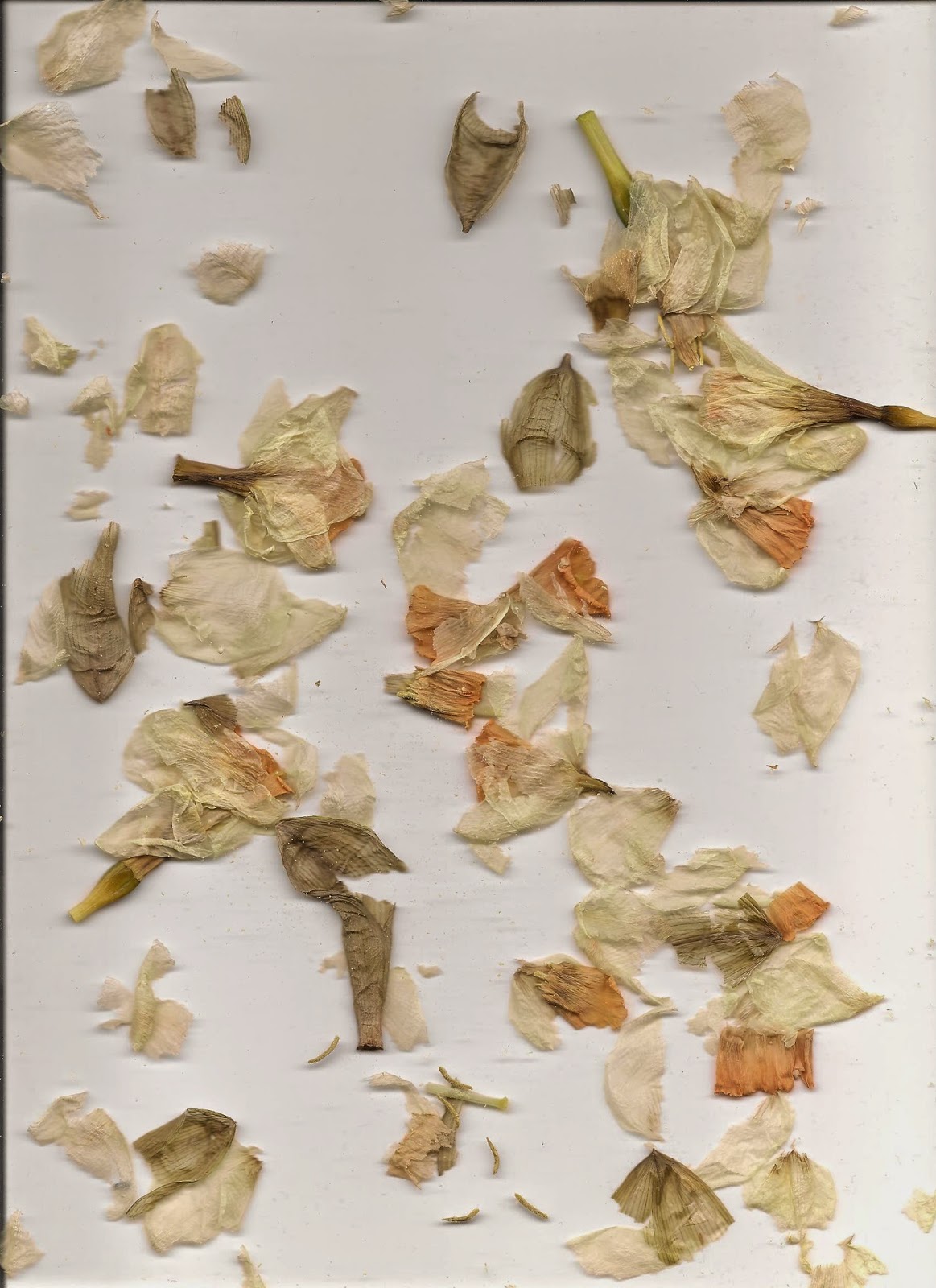
When focusing on the floral designs there were so many old decayed daffodils leftover so I thought it would be interesting to photocopy them as the details and petals would show up beautifully, and I love how compressed the flowers get also which happens to makes the old flowers look even sadder. Perfectly enough for this I had my nails done which seems to add to these images brilliantly and makes the contrast of fanciness and misery greatly. I never expected these photocopies to look as they did as they look more like flowers floating in water which is almost like a happy accident but the polished quality these images are a great example of what I am trying get my final garment to have the essence of both polished but a tattered quality.


All self created photocopies.

9.4.14

Pretty Cliches

Since this project is a mix of fame and misery with the helping of decay, I wanted to look at something more 'pretty' after working with plastic bags which are considered more 'trashy' ironically; therefore as cliché as it is I swiftly moved into flowers which I would never do but I thought the decaying of flowers are a beautiful transformation to include.

One of the reasons I am looking at florals is to gain some ideas to create patterns for potential laser cutting ideas as I'm considering to add some sort of laser cutting on the garment to add an elegant touch to the piece. However I'm not too sure that these floral illustrations are relevant/strong enough to be used for the laser cutting since they feel too simple and not extravagant enough and not inspired by them to create a cutting pattern but I do want to use the flowers somehow.


Although I may not use the florals for laser cutting I do appreciate how amazing the daffodil looks once decayed and I want to involve them somehow since they still hold the essence and idea of fame, of how gorgeous and lively it is at the beginning and eventually it becomes useless and helpless; so the metaphor is there but I just need to find a way of including it in my final piece. 


All own work.

6.4.14

Garbage

Following on from my Hirst research I started sampling with plastic bags as inspired my the garbage bags tightly concealed into the glass boxes. I tried pulling at a plastic square at first to see how it will resist and tear but found that instead it created this rippling effect in the shape of my thumb which I thought looked intriguing. From there on I just kept experimented pulling, tearing and burning which also had an amusing outcome, bubbling the surface up and burning holes through which gave it an alluring texture which I just loved. Of course finding this perfect bubbly texture did only come after heaps of bad attempts on burning the sample too much which just gave it a simple wrinkled effect, as well as some other messy fiery attempts. But now I've found this bubbly texture I want to experiment with it on different materials and suited in different combinations. 


Own sample photography.

Own sample photography.

Own sample photography.

Own sample photography.