
11.12.13
Laser wheels of plastic steel.
So from the list of workshops that we had to choose from, laser cutting was the one that appealed to me the most as I loved using it at sixth form and thought it'd be worth it to learn to use the adobe illustrator software properly as I had only used 2D design before, not illustrator. We were first assigned to meet at the Design Museum to visit the current Paul Smith exhibition. From this we were told to gather as much insight as we could for our projects.


After many hours of waiting by the laser cutter, watching each tiny whole be burnt out individually, I finally had my all my cut outs ready for the final thing. I had created some designs of neck pieces so I went from there, attaching different wheels with jump rings, making something small to begin with but gradually adding more and more until I had a final piece.


Fig 1. Paul Smith Exhibition (own photography)

Fig 2. Paul Smith Exhibition (own photography)

Fig 3. Paul Smith Exhibition (own photography)

Fig 4. Paul Smith Exhibition (own photography)
A reoccurring theme throughout this exhibition seemed to be Paul Smiths focus on travel in the photographs and equipment/accessories he collected. I found the placement of them equally shared out throughout the collection, vaguely grabbing my attention throughout. The room with the bicycles and skis and snowboard definitely added character and almost a source to Smiths travel photo's he had collected which interested me extremely.

Fig 5. Paul Smith Exhibition (own photography)

Fig 6. Paul Smith Exhibition (own photography)
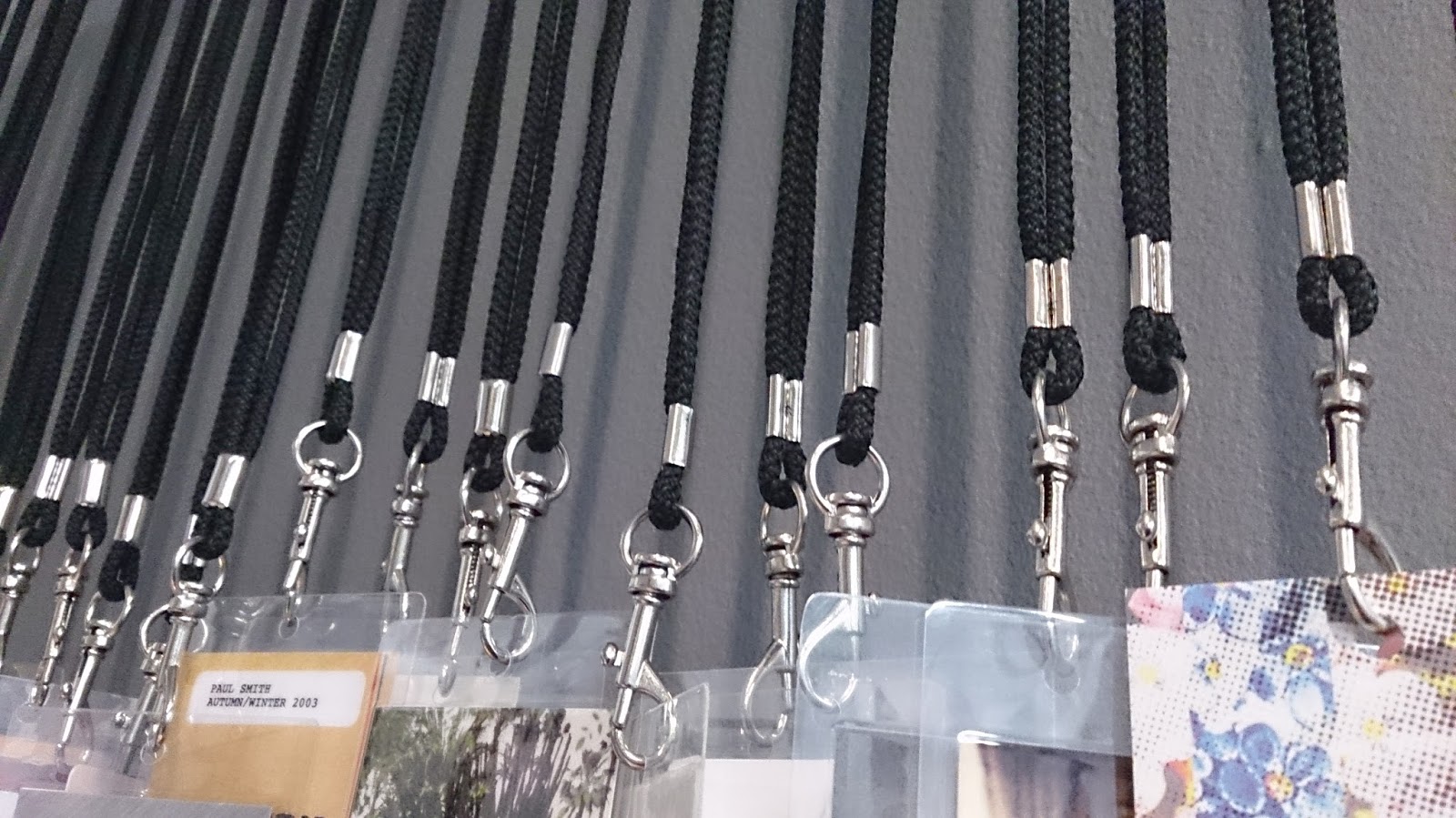
Fig 7. Paul Smith Exhibition (own photography)
Once we had taken in everything from the exhibition we were told to browse around London stores to gather inspiration for an accessory or product we wanted to create. From the exhibition I knew I wanted to keep the idea of travel close to me therefore keeping my eyes peeled for anything suitable. We headed straight to Selfridge's (well almost, after our stop to McDonald's that is) as their superstore seemed most appropriate for anything really. I had no clue as to what I was looking for, and struggled for a while as everything seemed basic and obvious. But as I begun to admire the huge baubles being hauled mechanically with massive clamped hooks on chains, I took a quick snap. Then in the technology section I found a motorbike poised beautifully with shiny wheels, which I also snapped up. These were the only photos I managed to collect however I felt they were all I needed.

Fig 8. Selfridge's bauble (own photography)

Fig 9. Selfridge's bauble (own photography)

Fig 10. Selfridge's Yamaha motorbike (own photography)

Fig 11. Selfridge's Yamaha motorbike (own photography)
This amazing wheel is the main source for my final piece as I played around with the shape and size of the middle plate quite a bit till I was happy with a final line drawing. With the line drawings we produced we had to place into illustrator to figure out how we would process the laser cutting.

Fig 12. Own illustration
I wasn't sure of what I was to to create for the final piece but I knew I wanted to create a crazy wild piece with influences from Iris Van Herpen ft Suzuki type of collaboration, very tough but artistic.

Fig 13. Collaboration Moodboard
With the line drawing I created I started to make different versions and also mini wheels to also laser cut which I thought would work well with the other pieces I had created. Once I was finished with drawing out on illustrator the designs I wanted to cut out, I decided on making a statement neckpiece which could represent a shell/armour in a way. I chose to do this onto silver mirrored acrylic perspex and blue perspex which would compliment eachother well and have the tough edge I wanted.

Fig 14. Laser Cut wheels
After many hours of waiting by the laser cutter, watching each tiny whole be burnt out individually, I finally had my all my cut outs ready for the final thing. I had created some designs of neck pieces so I went from there, attaching different wheels with jump rings, making something small to begin with but gradually adding more and more until I had a final piece.

Fig 15. Final piece
When I was making the piece I tried to spread out the large and small wheels equally which is highly effective for the piece as some parts are in your face as others are delicately laid. This piece is both a neck-piece and collar/mask to keep the sense of travel and protection involved in a semi-obvious way. I feel that the effort and time I have put into this piece has really paid off as it seems to sum up my project perfectly and embodies the influence I began with and the collaboration of the designers.

Fig 16. Final photoshoot
10.12.13
J.W Anderson 2.0
Once we were given the daunting aspect of a group project I didn't know what to expect, but when I got my chosen designer J.W Anderson it didn't seem so bad. We found that our group worked well and had very similar visions when it came to creating a collection and campaign which worked well for us as our final outcomes were exciting which led us to win one of the three categories (group that best understood the designer; if I'm not wrong).
This group project was a competition based around a theme we had to extract from a quote given to us, this immedietly put us all in a seriously competitive mood, two designers (Mary and Alexandria), two promoters (Ronan and Courtney), and two textiles/print designers (myself and Hannah); ready to create a collection and campaign to beat the other teams. Once we grouped up we realised we were a smaller group consisting of six of us compared to other groups of eight or ten people, which we were pleasantly relieved about. We all began with researching every aspect of J.W Anderson's past collections and campaigns, the shapes and theories behind his designs which we discussed as a group, feeding off each others ideas from what we had found. We mutually decided on a theme of contrasts gas/solids, rough/soft, light/dark etc which we felt was a positive reflection of Anderson's past designs which are usually very geometric, boxy, clean, and androgynous.

Fig 1. My personal concept board of J.W Anderson's past collections.
My job on the team was to create textiles/prints for the collection which would be used moderately as we found that Anderson kept print and texture to very mute minimum at most times along with colour also. Our colour scheme was a very clear choice of greyscale, navy and a slight pop of a neon-like yellow which felt very J.W Anderson.
As I looked through the past collections I found that shibori was used many times in different ways either heavily as a full garment or slightly as a sheer top which was an interesting balance. Shibori is fabric manipulation technique which you create through wrapping fabrics around nails or coins to create a 3D texture which can have varying interesting outcomes each time.

Fig 2. J.W Anderson shibori top on style.com
I immediatly started experimenting with different organzas and chiffons, creating different textures and patterns with whatever metal bits I found at home and created a different selection of textures which could be used for our final collection. I also created a form of shibori by pulling fabric through cut out paper which i then ironed over to create triangular creases.

Fig 3. My shibori process.

Fig 4. My own shibori. Ironed paper.

Fig 5. My own shibori. Wrapped metal, steamed.
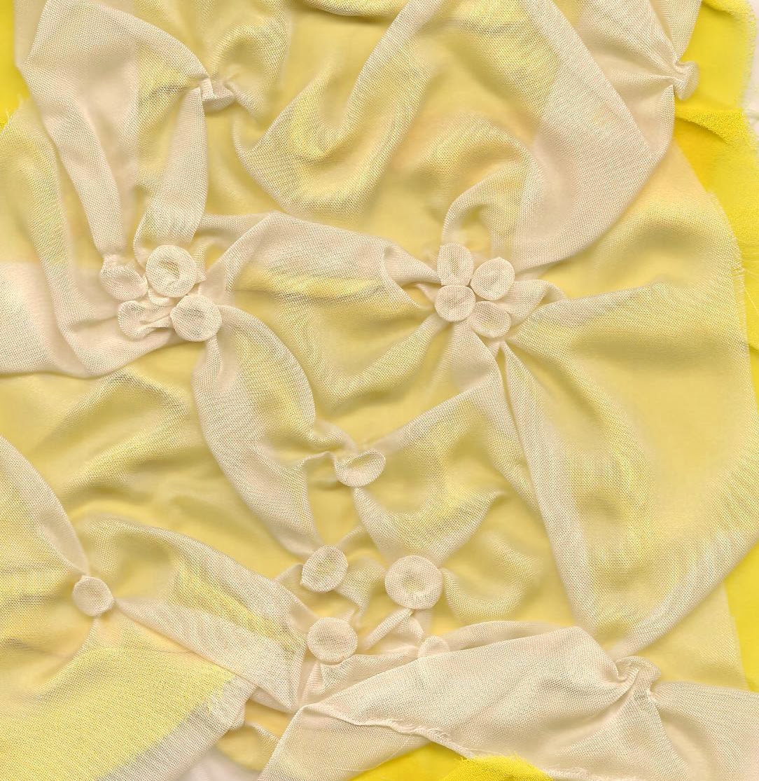
Fig 6. My own shibori. Wrapped metal, steamed.

Fig 7. My own shibori. Ironed directly which shrivelled the material.
After finalising the shiboris I created I chose to look into basic fabrics that could be used with the collection such as neoprene, heavy cottons, and rubberised cottons. I thought these were best because of their heavy/boxy appeal they would have once crafted into garments.
Further developing the thought of textures that could be used I decided that quilting would make a perfect match in the collection because of it clean and simple appearance with added geometric qualities. I thought neoprene would be perfect for quilting, however I couldn't afford to pay £20 a metre so grabbed half a metre of wet suite fabric which I simply doubled up and quilted over on my machine at home.

Fig 8. Own quilting.

Fig 9. Own quilting.
Once I had finished creating different textures, I regrouped with Hannah who had been creating the prints for our collection, we decided on transferring our prints and textiles onto photoshop to create patterns with them. Then as a group we decided that myself and Hannah would transfer the colours and patterns onto the designs created by Mary and Alex via photoshop as the final task before our presentation.
Since I felt confident using photoshop I was glad to insert all the prints and textiles into the designs to make the collection come to life.The designer created two individual collections, menswear and womenswear, I worked on the womenswear and Hannah done the menswear.


Fig 10. Materials I used.

Fig 11. The photoshoped final collection, womenswear. (Designs not mine)
This project was seriously more fun and challenging that I had first expected it to be. It was difficult at first dealing with a new group dynamic but after the first two days everything became so much more easier as everyone understood what they were meant to do both for their personal brief as well as for the group outcome. The presentation was an interestingly exciting process as it felt like a formal business presentation which is great practice for us. Every group was given a maximum of ten minutes to present, but we decided to keep ours sharp and simple, enough for people to remember but quick enough for them not to get bored. We managed to discuss everything; our inspirations, collections, textiles and promotion: with a video as part of our campaign. I feel we all worked immensely hard and cooperated well as a team with equally added efforts from everyone which made the experience an ongoing joy throughout the two weeks we had.
Subscribe to:
Posts (Atom)